Grid System
A grid system helps the content to follow a logical order and increase readability.
Baseline
The Strapi type stack specifies 14px/0.875rem for the base font size, which produces an 8px x-height. The x-height is halved to produce a 4px baseline.

All our “components blocks” flows vertically along this baseline, creating a similar rhythm across all screens.
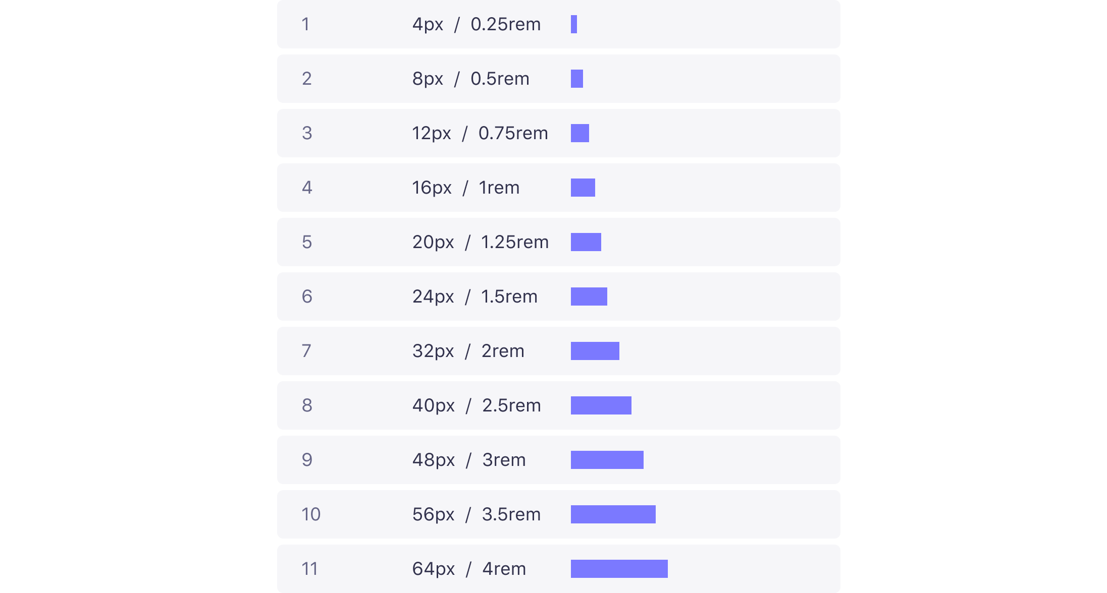
Spacing System
Use multiples of 4px when defining measurements, spacing, and positioning elements.
Best practice
‣ When necessary use 4px to make more fine tuned adjustments.
‣ Whenever possible, make sure that objects line up, both vertically and horizontally.
‣ Align your bounding box to the grid, not the baseline of your text.
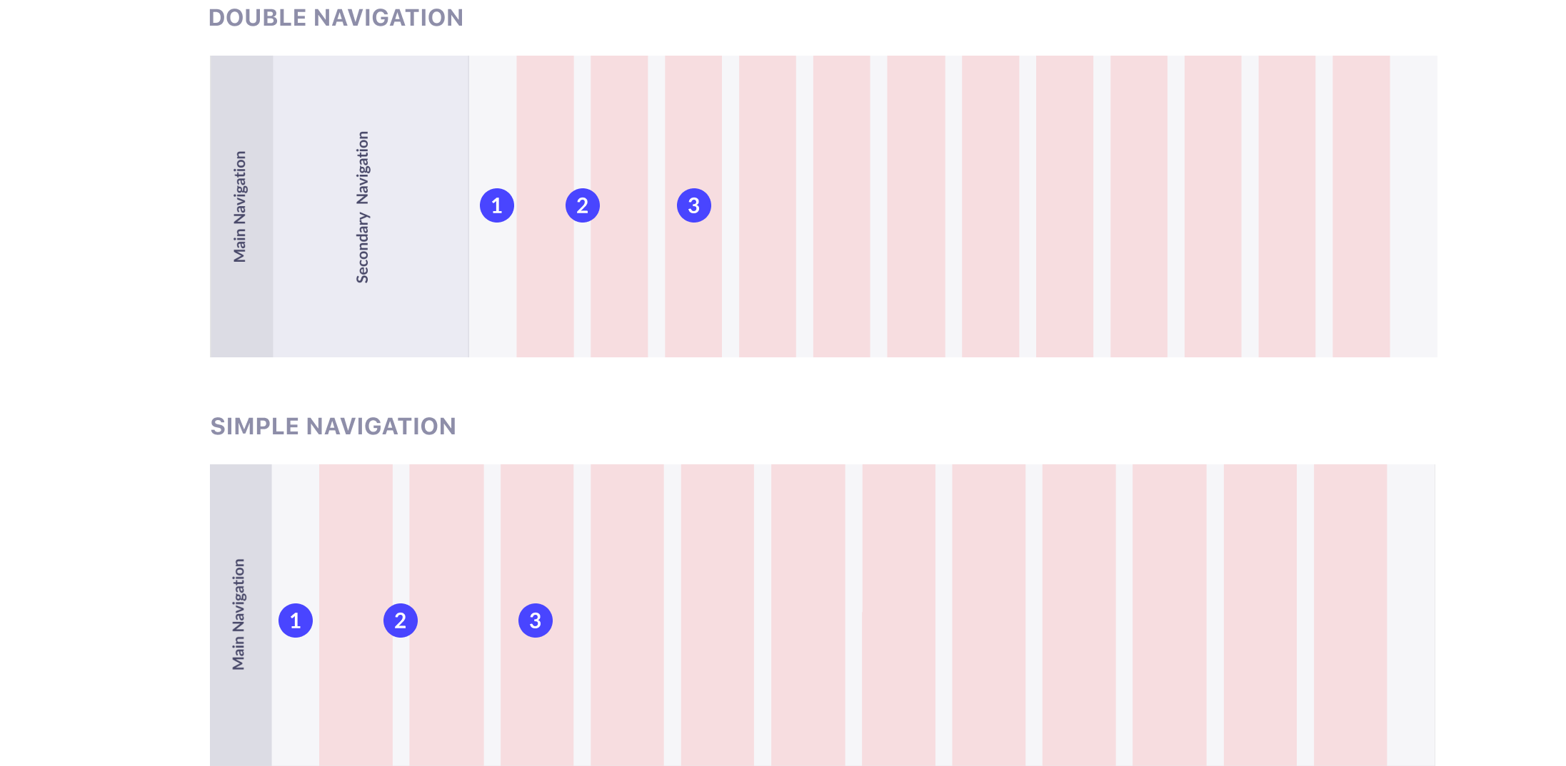
Responsive grid
A 12-column responsive grid is applied to the entire interface, except the main and secondary navigation.
We use fixed margin of 56px and fixed gutters of 20px to ensure consistencies in our alignement. The column width varies depending on screen sizes.
1 - Margin : 56px
2 - Gutters : 20px
3 - Columns : 12
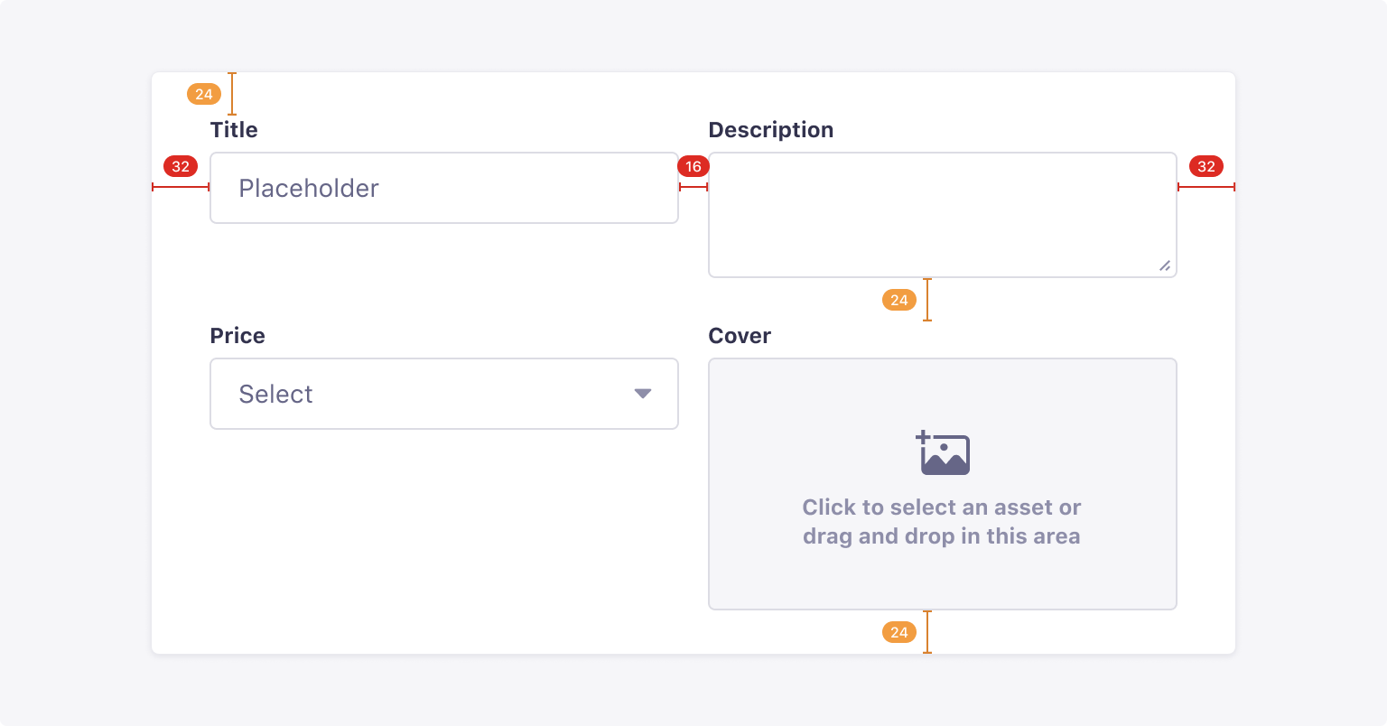
Building a form
The grid is especially important to build forms. Forms have a very specific and consistent structure across the Strapi product. They include a container in which inputs or other components will be added.